<< go back
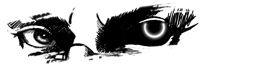
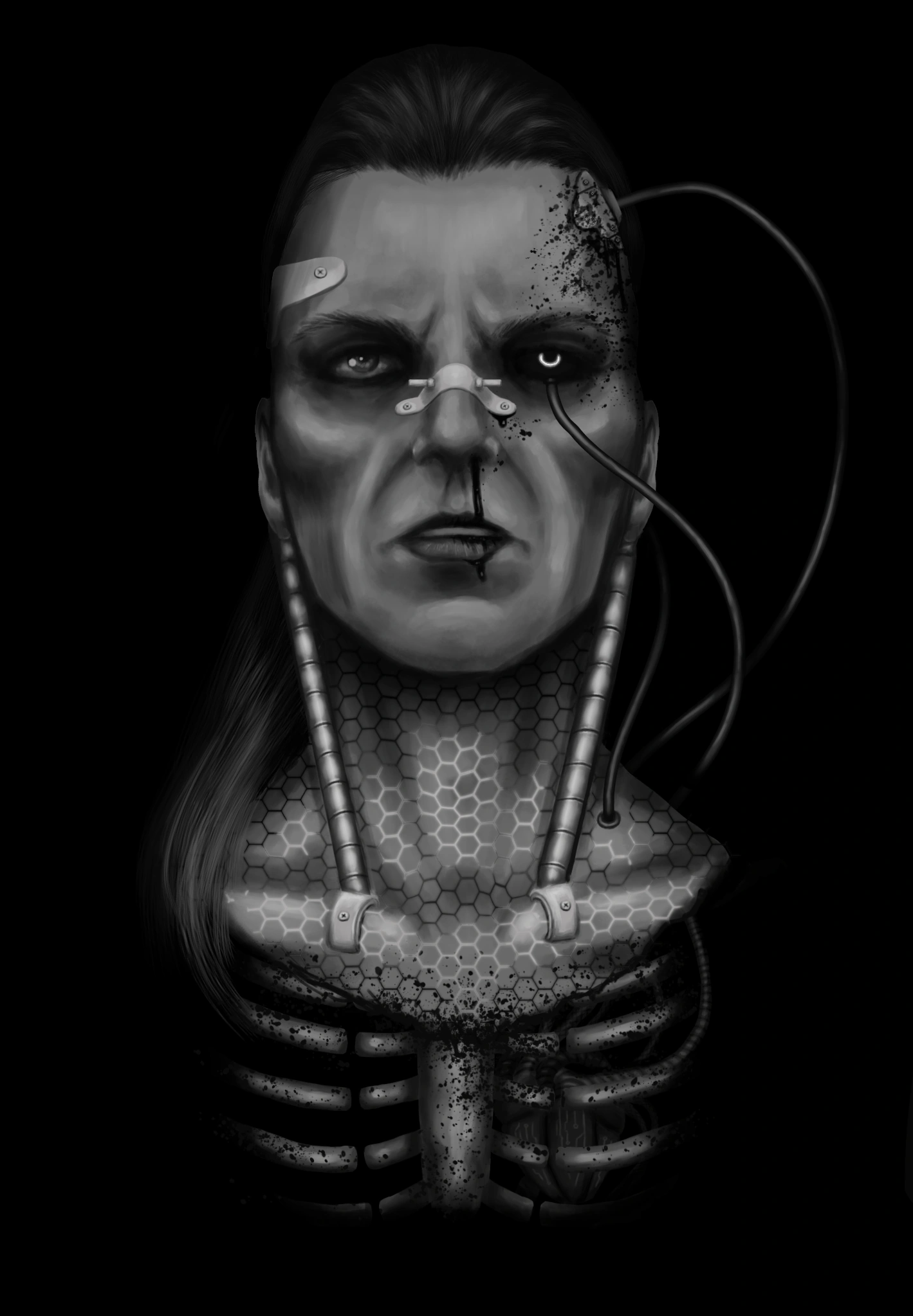
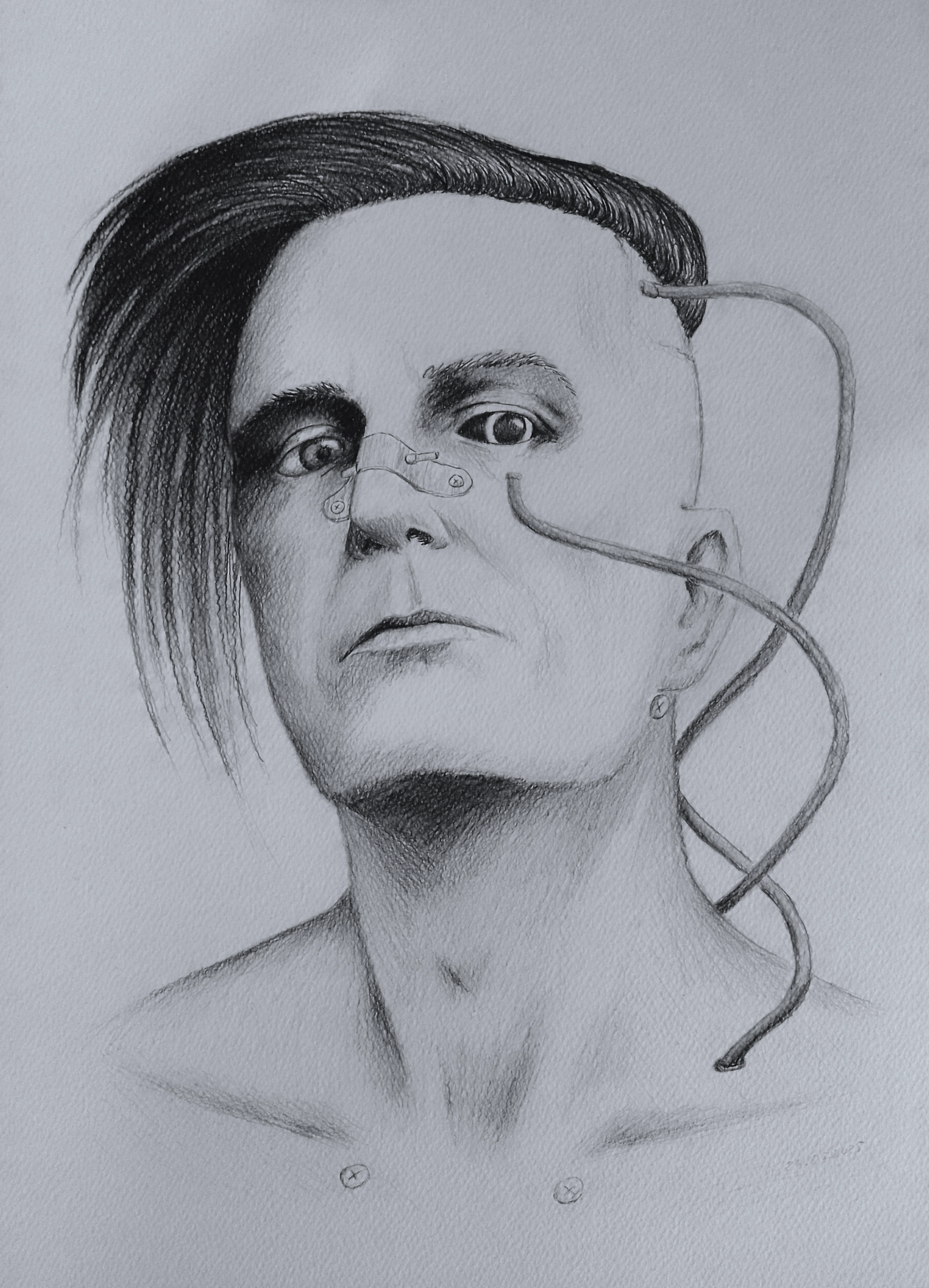
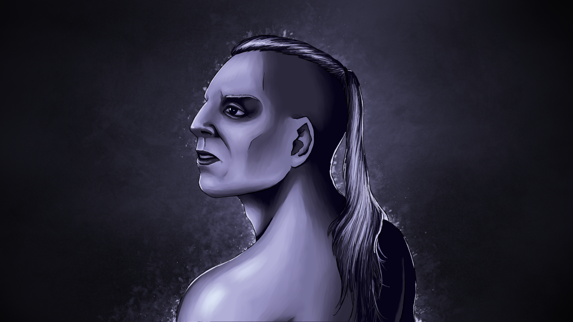
Inspired by Star Trek, hence the black eyes.
To be exact, ST:Voyager
"Meld" episode.
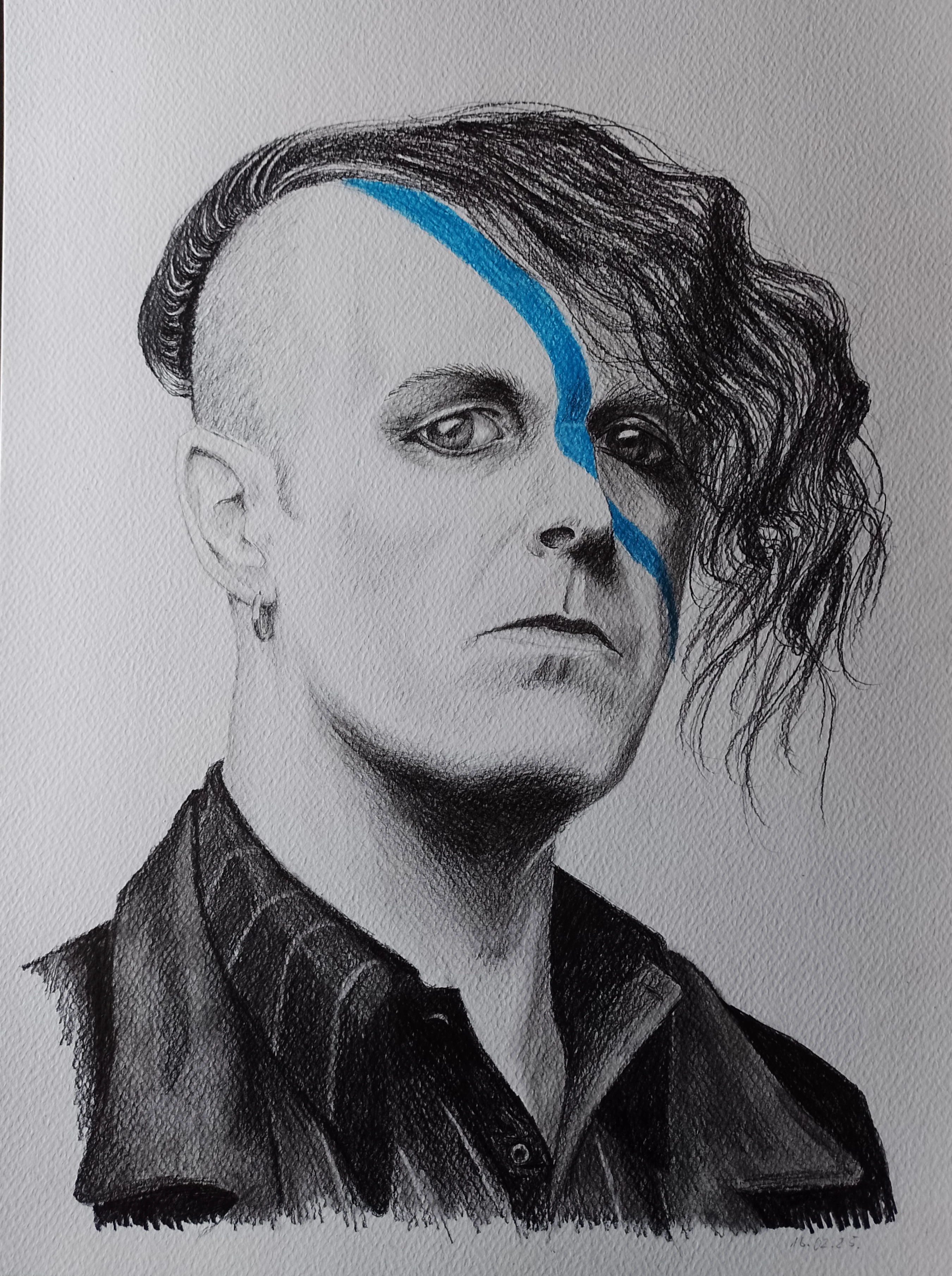
This portrait was heavily referenced from
this photo of Till Lindemann.
Inspired by a portrait inspired by an album.
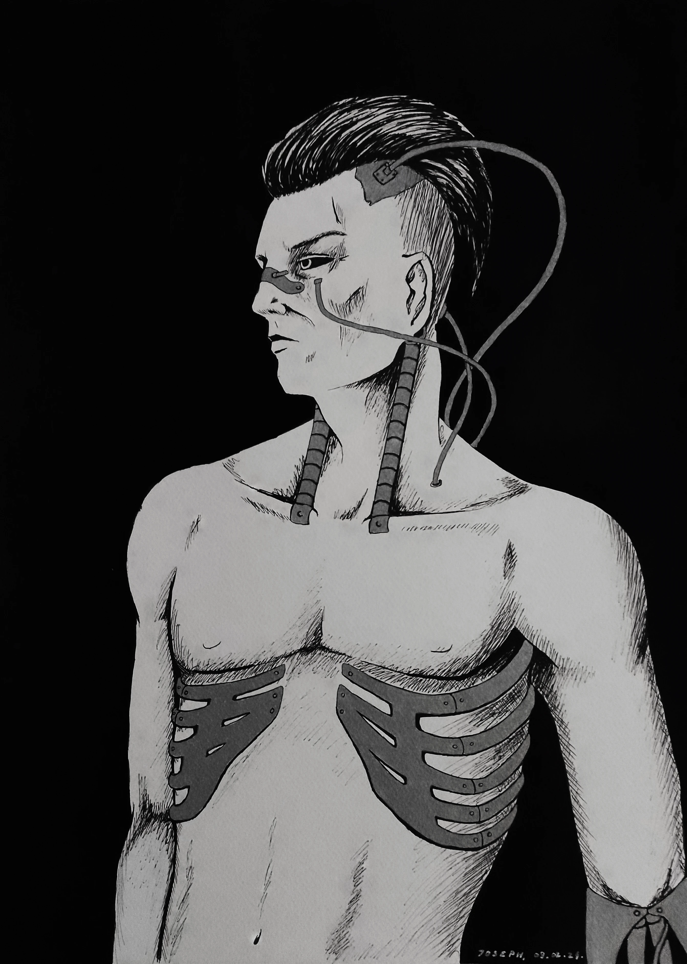
Made a long time ago actually. Such a gentle portrait.
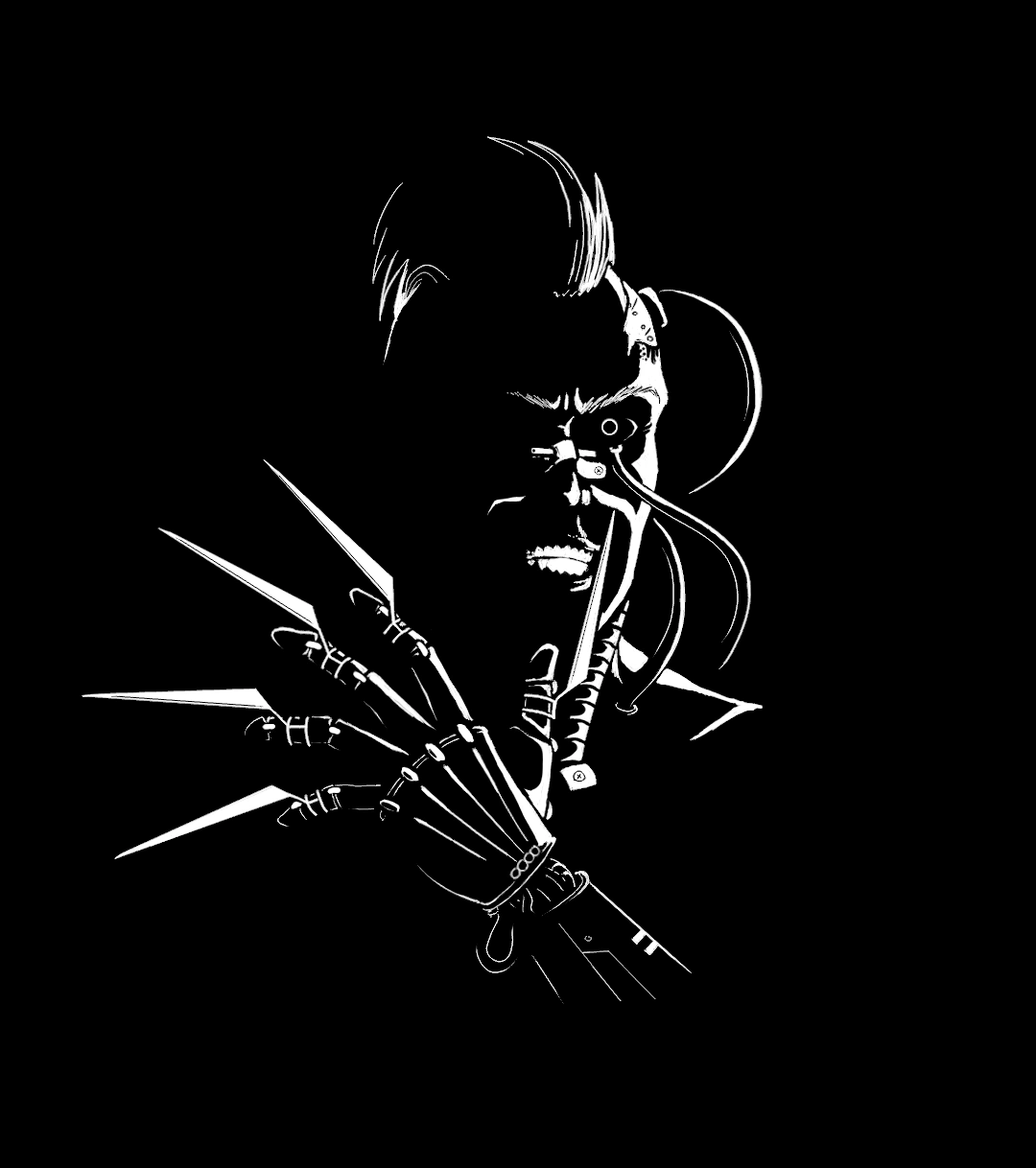
For my first custom t-shirt
I swear it looks better on cloth lol.
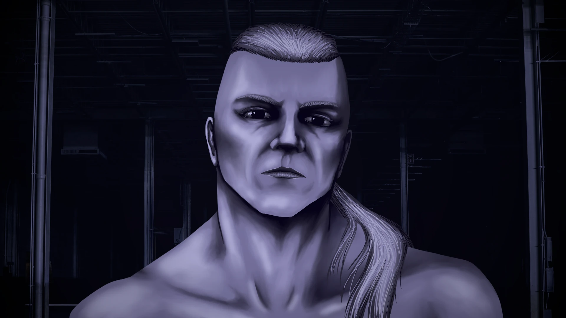
He was supposed to look comatosed or unconscious, instead he looks high...
Yes, i overpainted, i did not intend it to be so "sharp"
Second custom t-shirt, Joseph smiling kindly and sweetly :)
Background
here
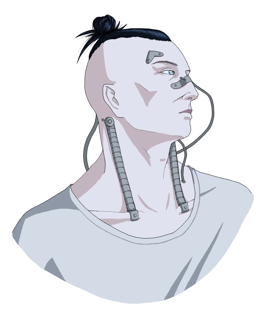
Took me a few days! Almost as i intended it, maybe even better. I like how he looks, very cold.
Yes, i really like this palette.
Background again
here
This one looks cleaner. I wanted a different background but couldn't find anything else fitting.
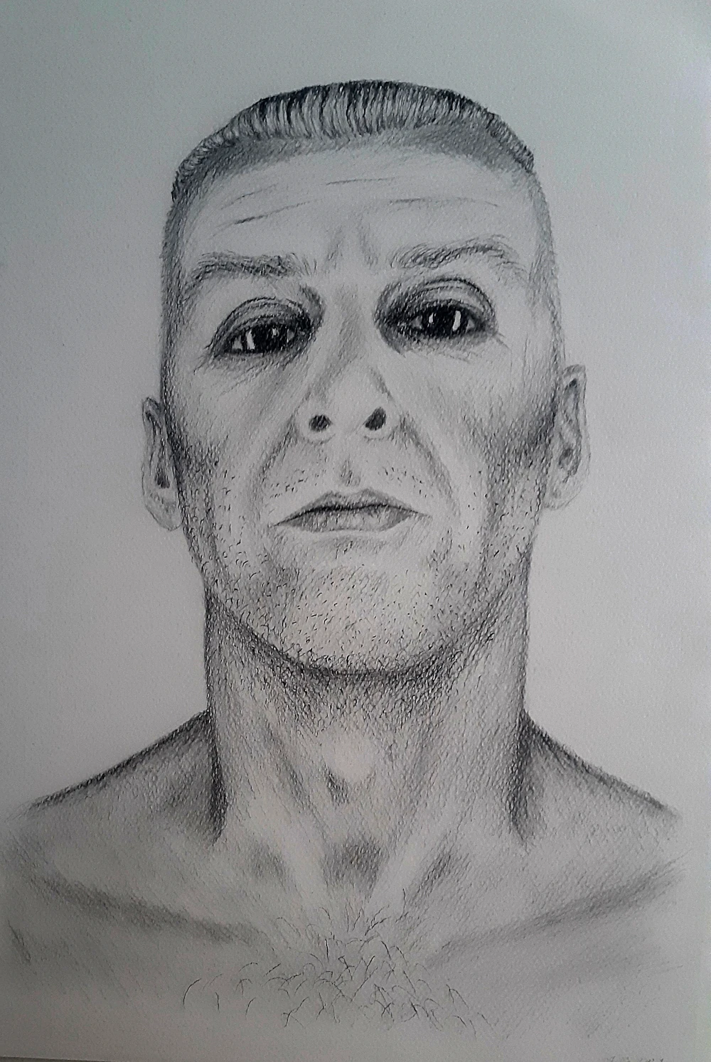
After 4 years i decided to give pencils another go.
Here is the source photo.
Kinda looks like a sad hungry panda bear.
Here is the source photo.
i am ~70% satisfied with the result.
I know the shade under his chin is weird, i fixed it but the photo is not up to date.
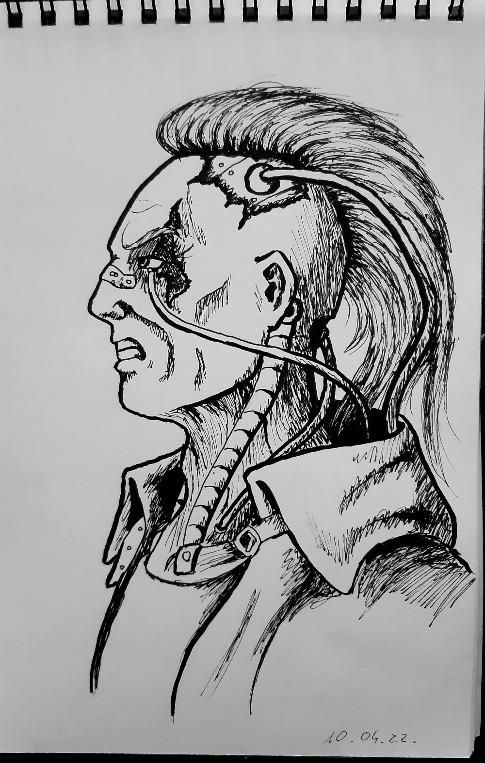
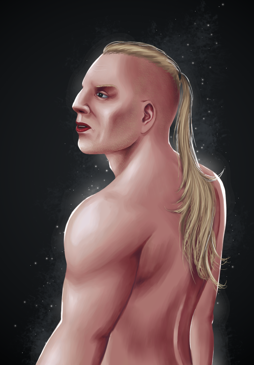
Getting into painting again and getting out of a rough patch.
Doing some warmups and immediately attempting more ambitious stuff. Still i think it's pretty decent.
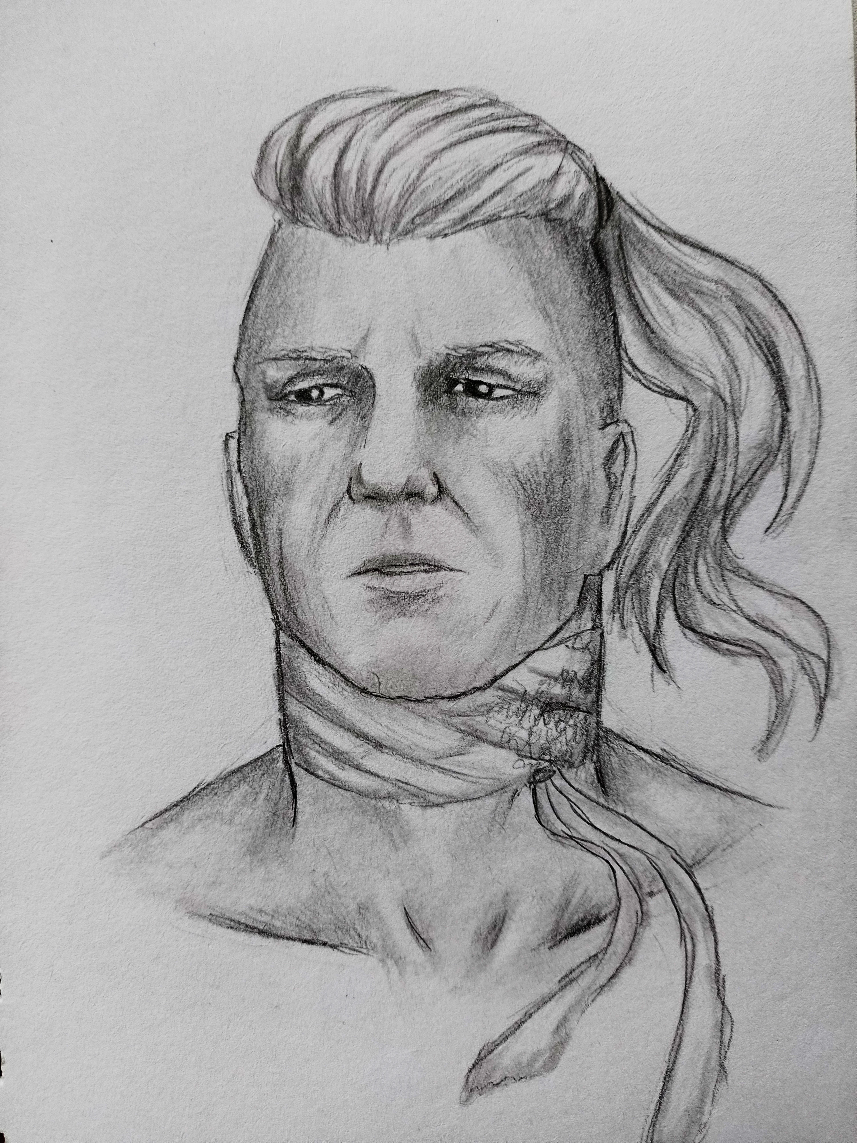
While working on a portrait for both dudes, i keep making new versions because i like this pose (and palette) a lot.
I will most likely be updating this section.

