home visual written music links journal

The subpage nobody needs but I'm putting it up anyways (just like this entire dumb page of mine)
<< go back to visual

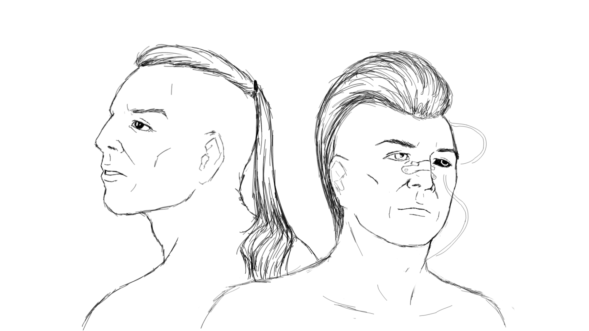
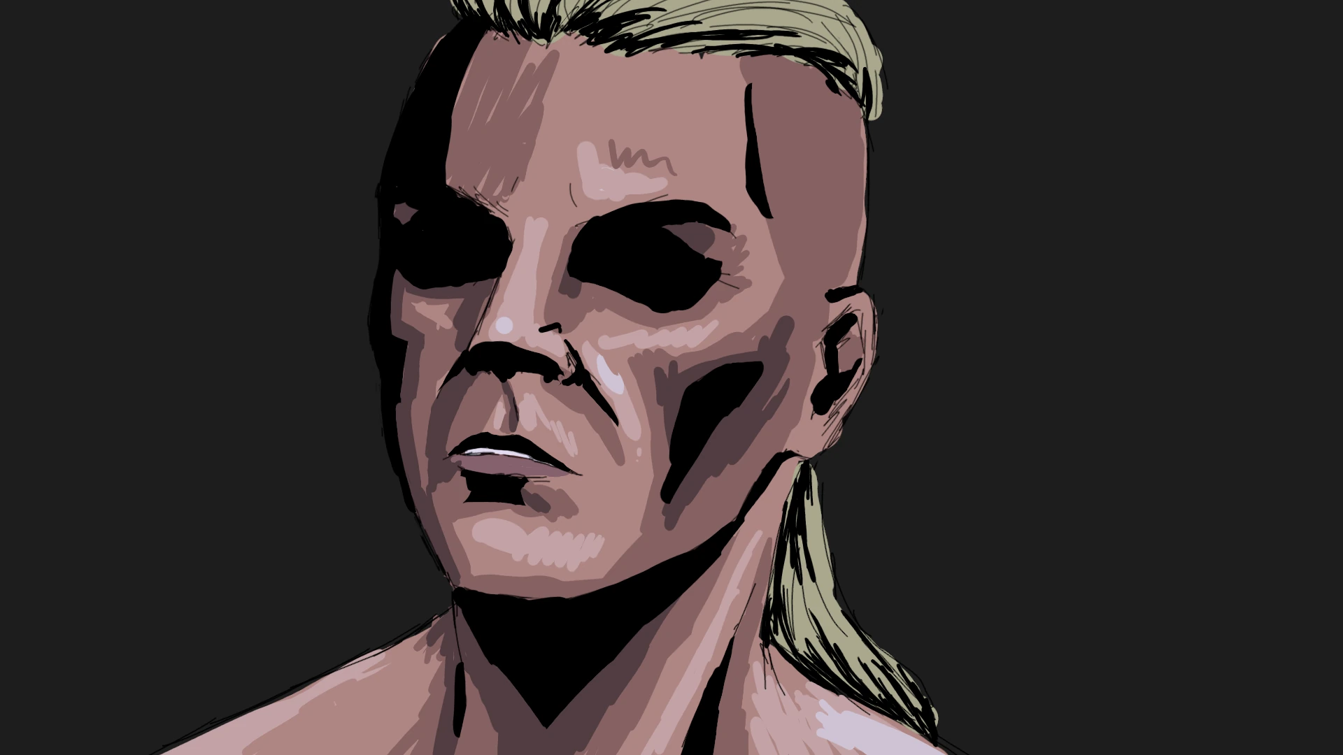
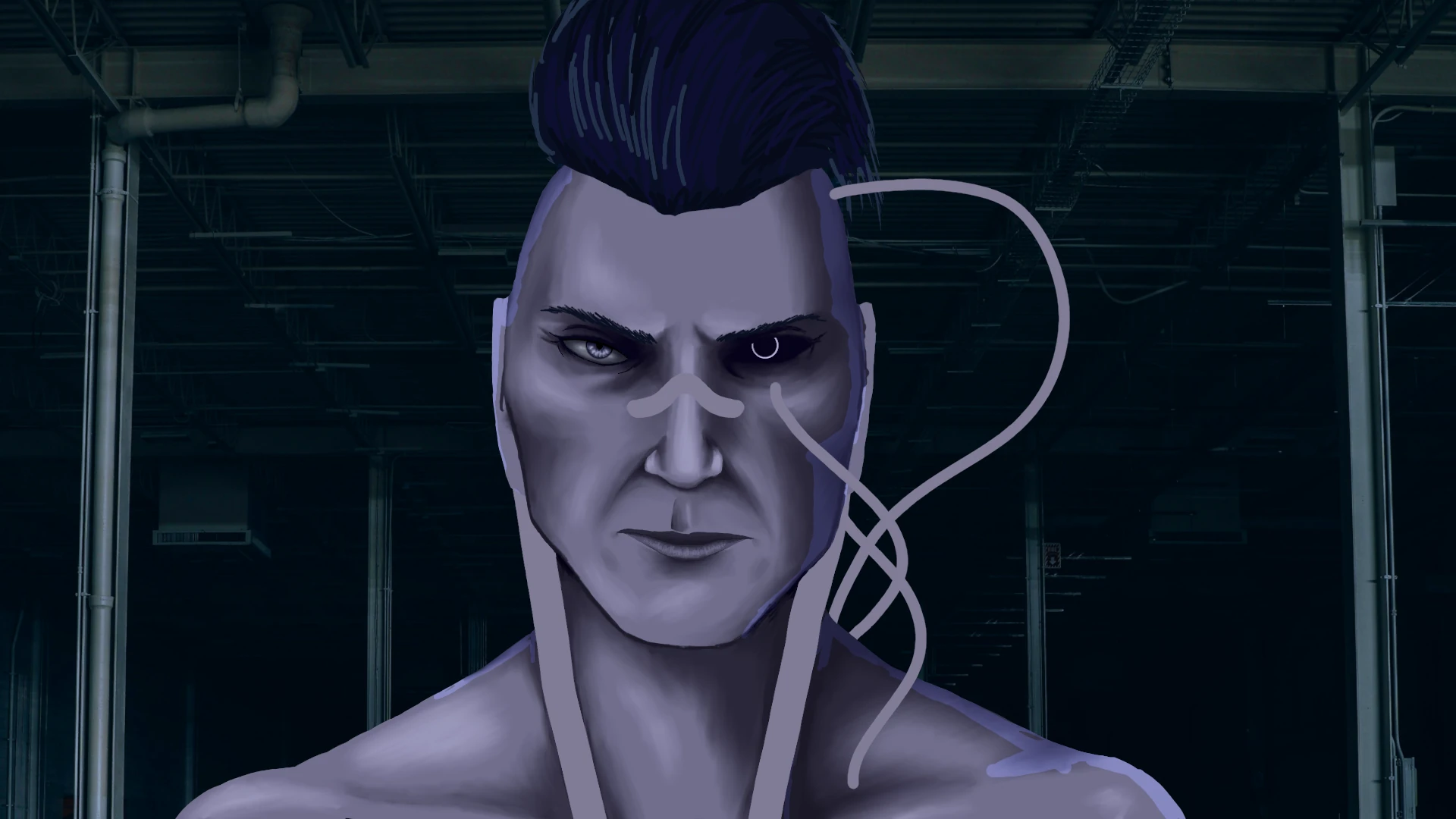
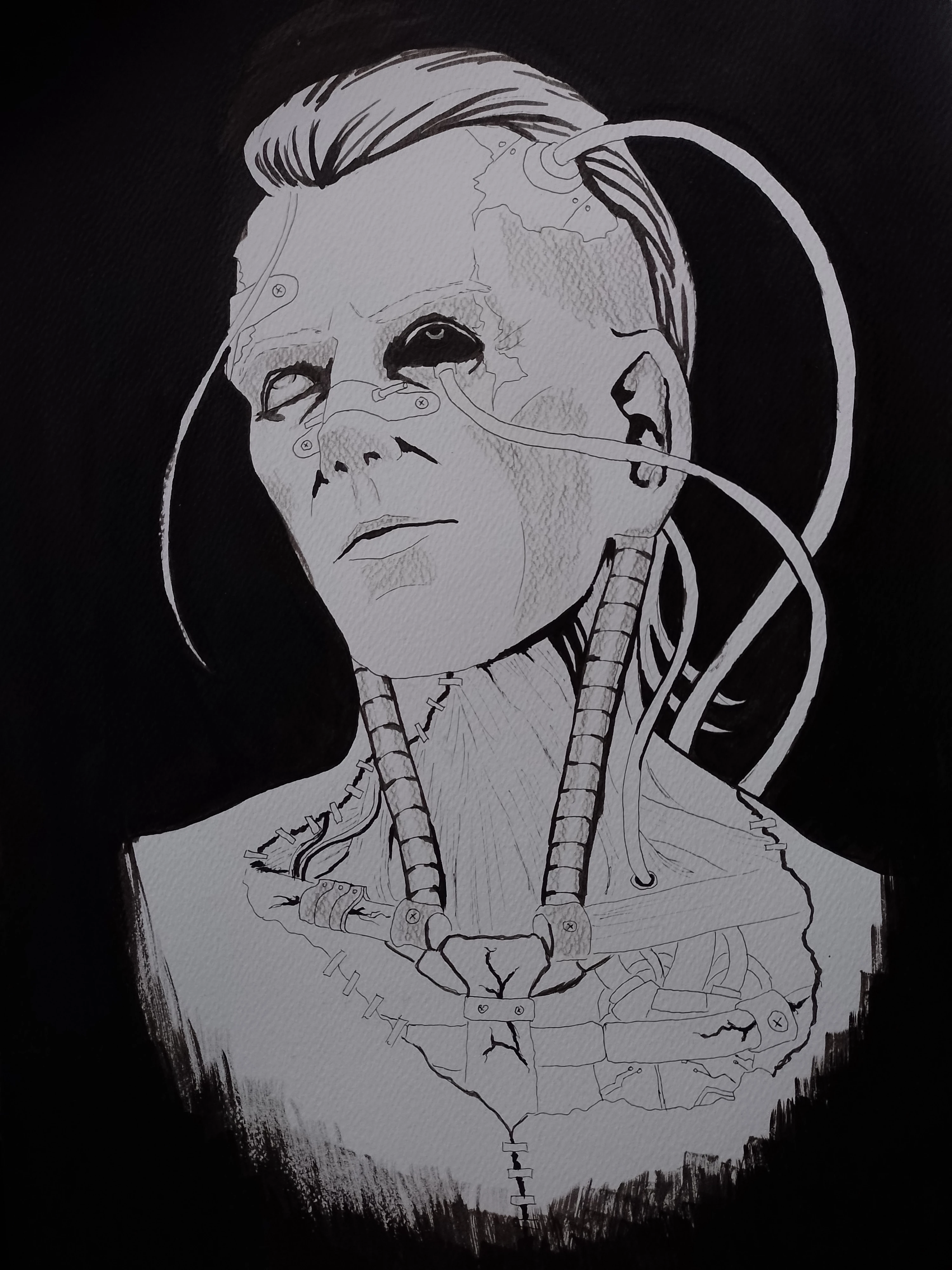
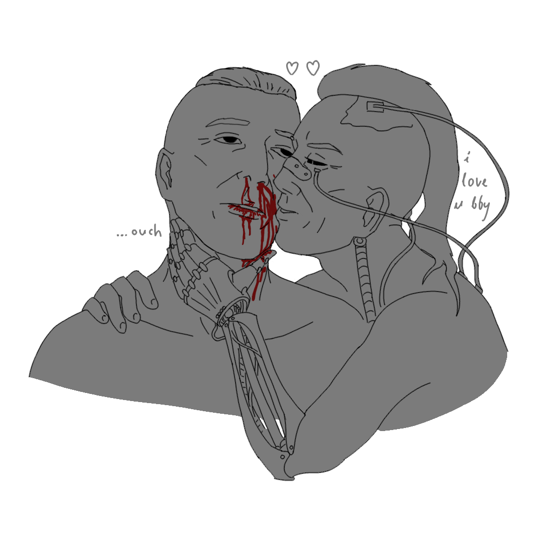
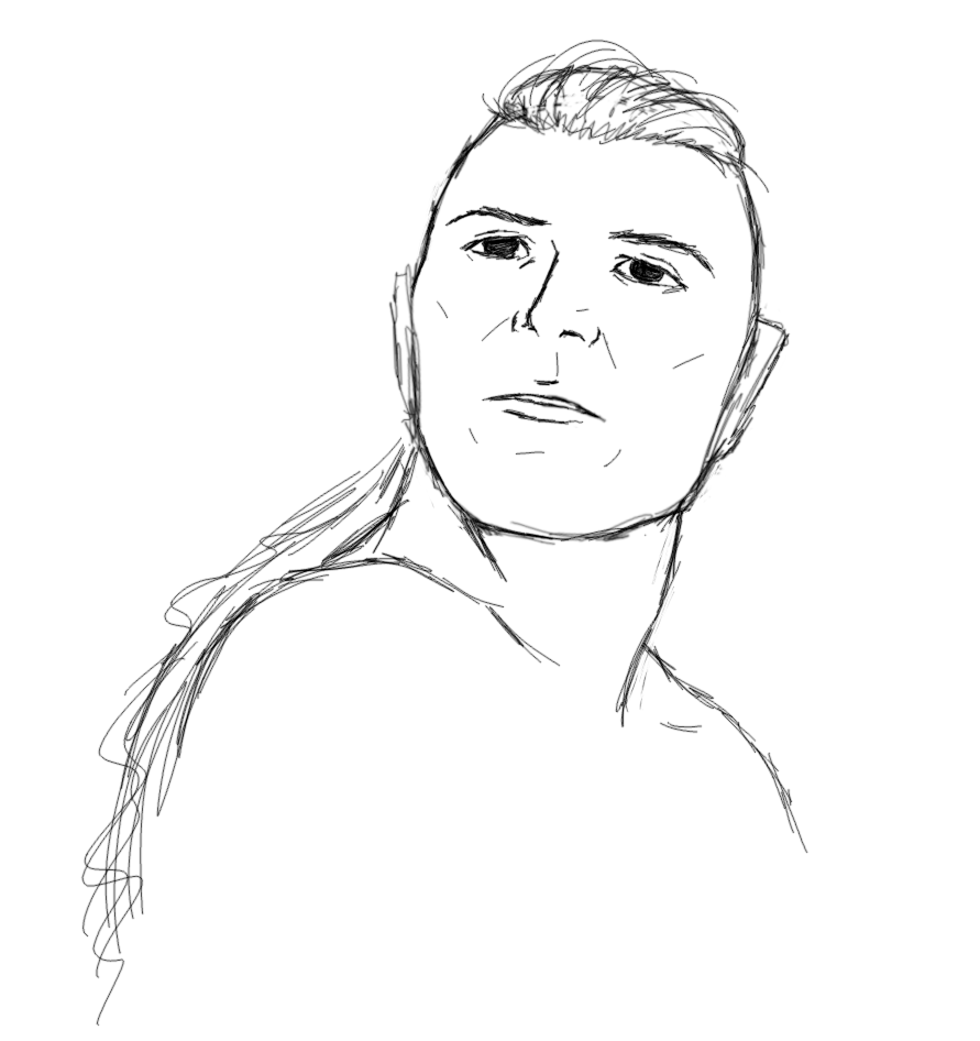
While making new background I thought each of them looked funny in their own way. These captions don't even match them, they just fit their expressions.
Background of background
Super easy way of making slightly decent nebulas in GIMP. I'm sure you can perfect it if you actually put some effort, unlike me:
- render Plasma noise with hight turbulence, keep changing turbulence and seed until you get a pattern you like
- decide which colors you want to keep
- select these colors, invert, delete the rest
- copy layer, move below, gaussian blur 1.5
- repeat above but set gb to ~15
- if you have too many colors and want them the same, just use Colors > Hue-Saturation and adjust selected hues
- oil brush for some rough filling underneath
- standard round brush, size 1-2, spacing 5000 for little stars
- oil brush ~100px size, pressure opacity (or decrease brush opacity), bright color for glow on top of clouds
- same but dark if you want to separate some clouds slightly
- MyPaint spray brush for some other stars/splatters: size ~3.5, opacity almost to max, hardness to minimum. Or just one of bristle brushes with presets for little stars above.
Background here
I am trying really hard to make it look decent. I already failed at preserving the idea I had.


Quite an old unfinished piece, Joseph more close to what i intended to draw for my tshirt. Maybe i should finish o remake it one day.
...ouch
Got stuck with this one

Since I drew him messed up, I felt obligated to "fix" this. I even managed to draw him smiling, which is a huge accomplishment for me - they are always so serious in my drawings!

I will most likely be updating this section too.