| < home > | < visual > | < music > | < links > |
A guide to lineart by a person who doesn't know how to do lineart
> TRADITIONAL
If you experience too much tension/shaking when trying to draw smooth lines, or simply are unable to draw a relatively straight line, there are a few tricks I developed:
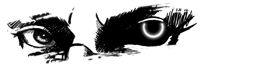
> make the lines thin, gentle, only a base for the rest. You can "see" that with some paintings here that seem mostly done with ink there appears to be only shading, but if you zoom in, you might see some lineart there underneath.
It does it's purpose tho: it complements the whole thing and provides a base for the colors, shapes and shades.
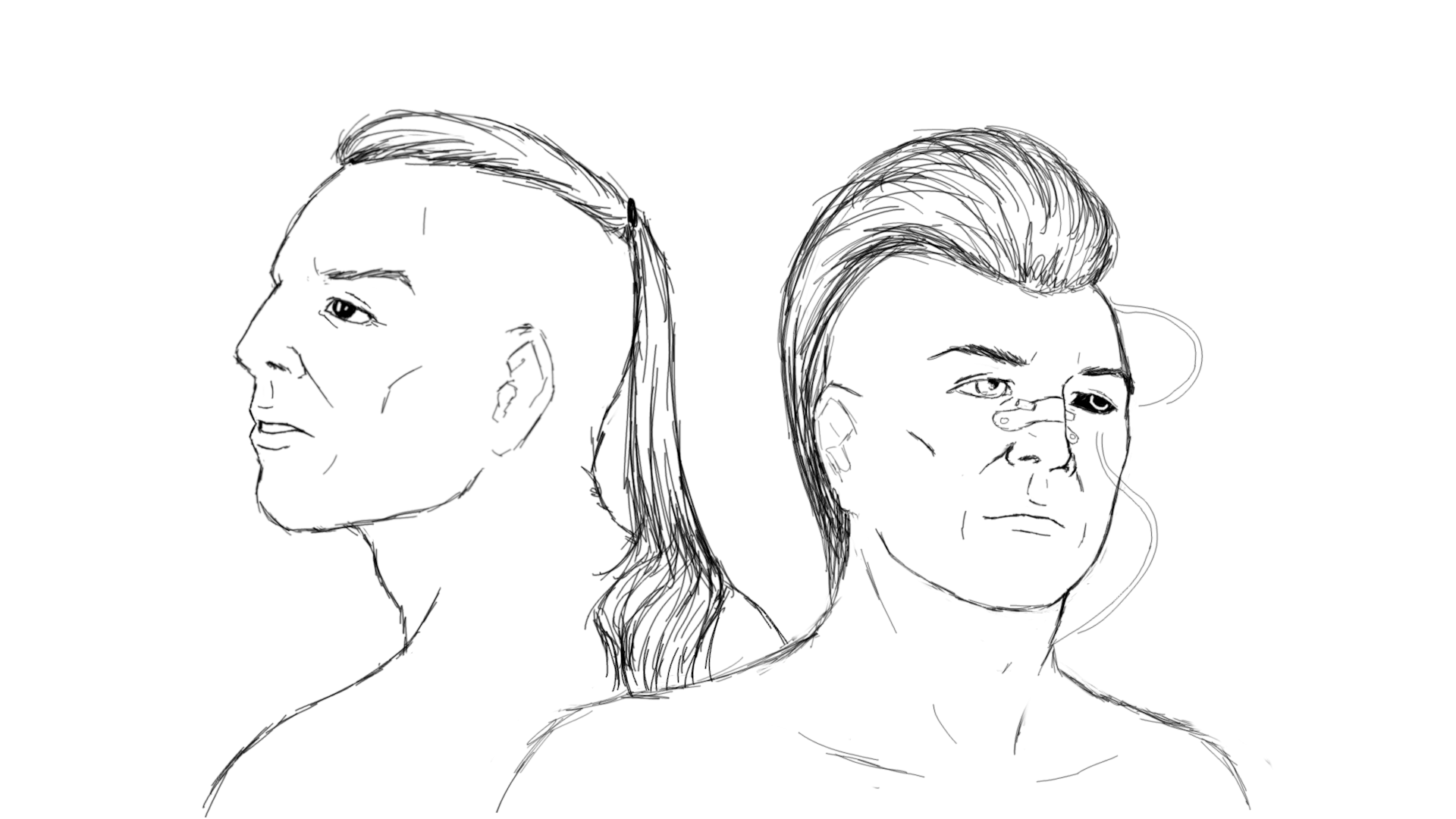
> If you do not aim for a painting (either watercolors, ink, crayons, whatever) but only lines - the trick is to use short lines that connect crudely to each other,
making the thing look spontaneous, a bit messy at first. I would definitely not be able to draw over a face in one-two goes, so i carefully connect short lines. If you feel adventurous,
you might just drop more loose strokes to make it look messy on purpose. Imagine drawing a fur, but you arrange singular hair into a line. Use very thin pen for this, and the more organized
that sewn-together line is, the more it is possible to draw over it, creating a bit more thick, but convincing line.
I mostly do sketches like this, just very chaotically.
> DIGITAL
 For this text, I will be focusing on GIMP.
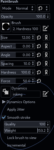
This one is much easier, because of unlimited use of Ctrl+Z and an option to smooth the strokes.
Smoothing works amazingly well with lines that would otherwise be shaky and all the ways around.
However, it won't help with sliding to any other direction than the one you want go + it makes sharp and sudden turns tough on high settings.
Mess around with Quality and Weigh values and see what works well with you.
If you aim for a simple lineart for a piece you don't want to spend days on, the most basic 2px brush is good to go. The contours will be noticeable and give your piece a little comic feel to it.
Try smoothing option and see how it goes.
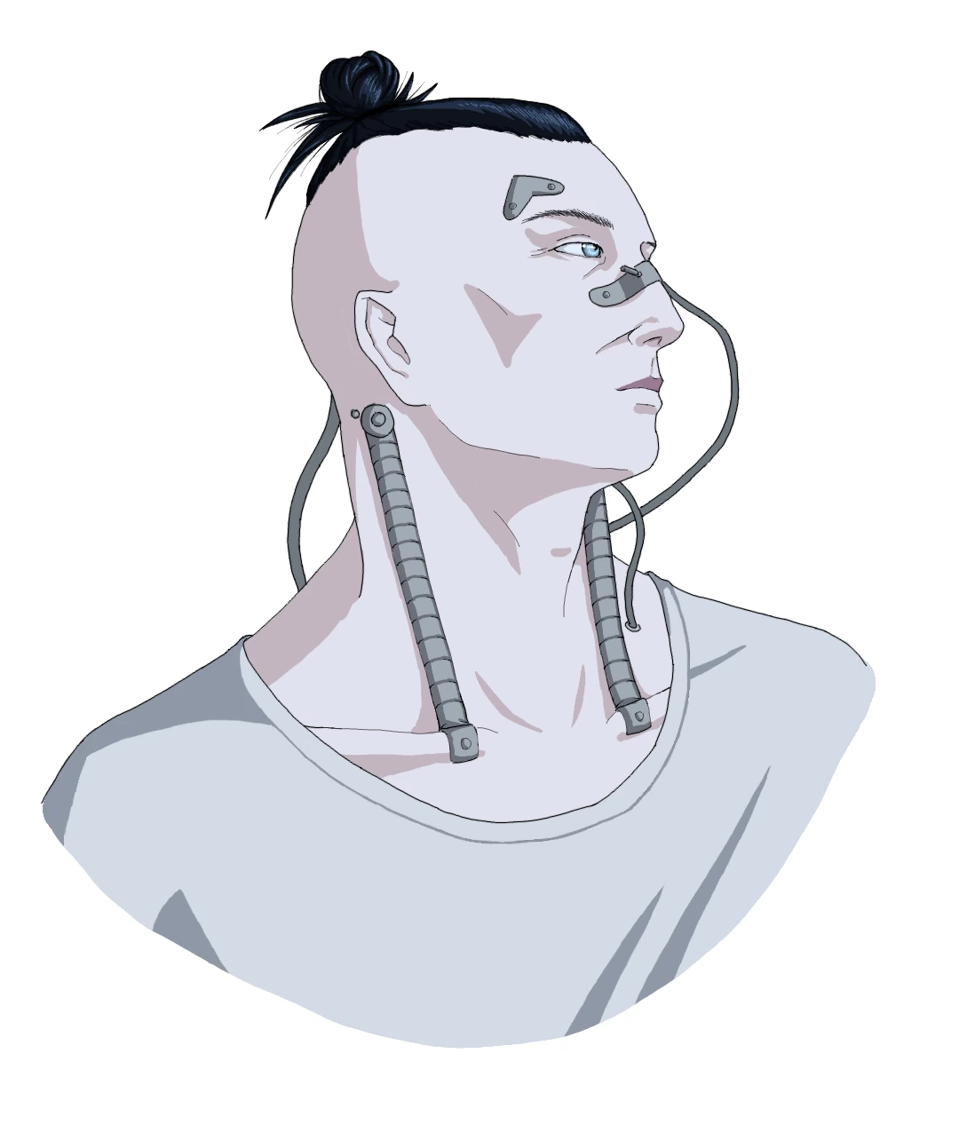
If you want to draw that fancy, cute, lovely thin contours - same thing, just select the 0.75 hardness brush 1px and go ahead. I drew casual J with that and i think it's amazing, taking into consideration the simplicity.
With those settings you need to pay a lot of attention to connecting lines together, as they easily stack and clumsy connections are visible. But that's what Ctrl+Z is for.
Do you know what's superior about GIMP? Brush dynamics.
Those include imitations of pencil, shader pencil, ballpoint pen, pressure to size/opacity and others. You can make your own if you don't like those that already are there.
All you need to do is experiment with settings in Paint Dynamics tab and save the results you like.
Dynamics can make your brush do some fancy things, but some settings require tablet for this, as pressure/angle/speed can determine the behavior of the brush.
Mix dynamics such as pressure>opacity with brushes such as Oil Paint and you have a tool to add some details to textures. Or create base for textures.
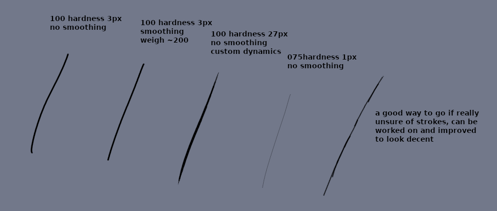
Why all the discourse about brush dynamics? You can use that to create a brush for inking and lineart. Generic brush might be too basic for some works. You can pair basic brush with custom dynamic to create something new. In the picture above i showed how my custom setting behaves compared to other generic settings.
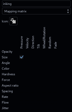
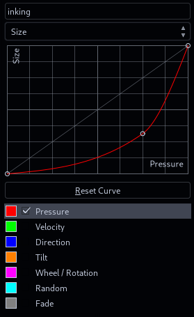 You can copy those settings. Open up that Paint Dynamics tab in any tab cluster you like, click Create New Dynamics and apply those settings. This will make your brush change its size with pressure you put on your tablet,
however you need to use slightly bigger brush, as this setting is quite sensitive and lowering the value significantly. However, it nicely imitates ink brush and you can make some cool comic stuff with it.
You can copy those settings. Open up that Paint Dynamics tab in any tab cluster you like, click Create New Dynamics and apply those settings. This will make your brush change its size with pressure you put on your tablet,
however you need to use slightly bigger brush, as this setting is quite sensitive and lowering the value significantly. However, it nicely imitates ink brush and you can make some cool comic stuff with it.
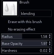 GIMP for quite some time now comes bundled with MyPaint tools (or does it? maybe you need to install them manually idk), which is great, because it has one useful tool - blending. While it's not on the topic of
lineart, i thought it is worth mentioning, as it saves you a lot of effort whether you need to find in-between colors for first layers, or to actually work on that thing.
GIMP for quite some time now comes bundled with MyPaint tools (or does it? maybe you need to install them manually idk), which is great, because it has one useful tool - blending. While it's not on the topic of
lineart, i thought it is worth mentioning, as it saves you a lot of effort whether you need to find in-between colors for first layers, or to actually work on that thing.
You just need to find that secret opacity/hardness setting that allows you to smoothly paint, blend, mix...
.